
Why Graphics?
The majority of people use social media on their phones, your content is competing against countless other posts for attention. One way to help capture your audience is with social media graphics.
A Buffer analysis found that that tweets with images received 18% more clicks, 89% more favourites, and 150% more retweets than those without.
That said, it’s really important to look at your own analytics and check what content performs well for you. Why not test different types of graphics, and photos and videos to see what resonates with your audience?
Tools to help
We love Canva, it’s easy to use, has a free version and requires minimal design skills. You can share designs with your team and build up to doing more complicated graphics like this one.
Top tools to create social media graphics from Social Simulator on Vimeo.
Unfold is an app with templates for Instagram stories. Again there are some free templates and more available as paid-for upgrades.
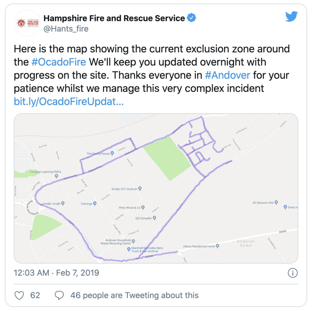
For showing an area of interest, or locations and zones for people to avoid during a crisis, annotating Google Maps makes it really easy for people to understand the location you are referring to. In this example from Hampshire Fire and Rescue service, the exclusion zone is clear at a glance.
For more complicated designs and infographics Piktochart and Easel.ly both offer free or low cost versions, with the option to upgrade for increased functionality.
Thinglink allows you to add points of interest to a map or image and explain them in a text box that only appears when people click on them. It allows you to add plenty of detail without the text covering up the image. See how it works in this example.
Want to create an interactive visual story perhaps a quiz or poll? Apester is great and used by a wide range of organisations including these examples from NatWest and Exxon Mobil.
Tips for social media graphics
- Create templates during quiet times so they are ready to use during busy periods or crises
- Ask your design team, if there is one, to help you set up templates that fit with your organisations branding
- Match colours using hex codes (six digit references that represent the intensity of red, blue, and green in a colour – you can add the code to most of the tools we’ve listed so that you can get an exact match for your organisation’s colour scheme)
- Check if the tools you use allow sharing with a team to minimise work and keep things consistent
- Keep it simple, make sure your design will be legible on a phone
- Remember accessibility – when sharing your graphic make sure the social media post also contains the same information as the image, or a link to it the information, there’s more on this in our accessibility for social media guide
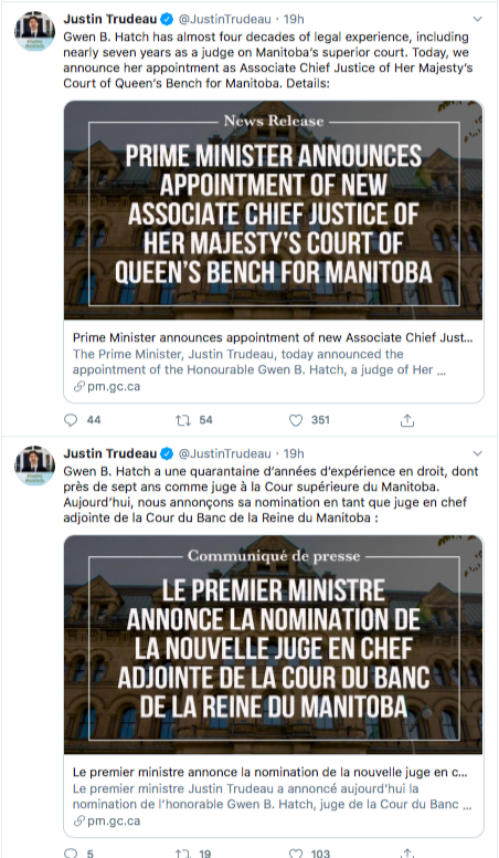
- Do you need to include more than one language, or create two similar versions. The Canadian Prime Minister Justin Trudeau shares the majority of his updates as separate posts in English and French that are issued straight after each other. No matter how busy you and your team are it’s really important to make sure that the translations are checked by a native speaker and issued together.
- Your graphics don’t need to all be identical – have a range of templates. This keeps them interesting and also stops people assuming they’ve seen it before.
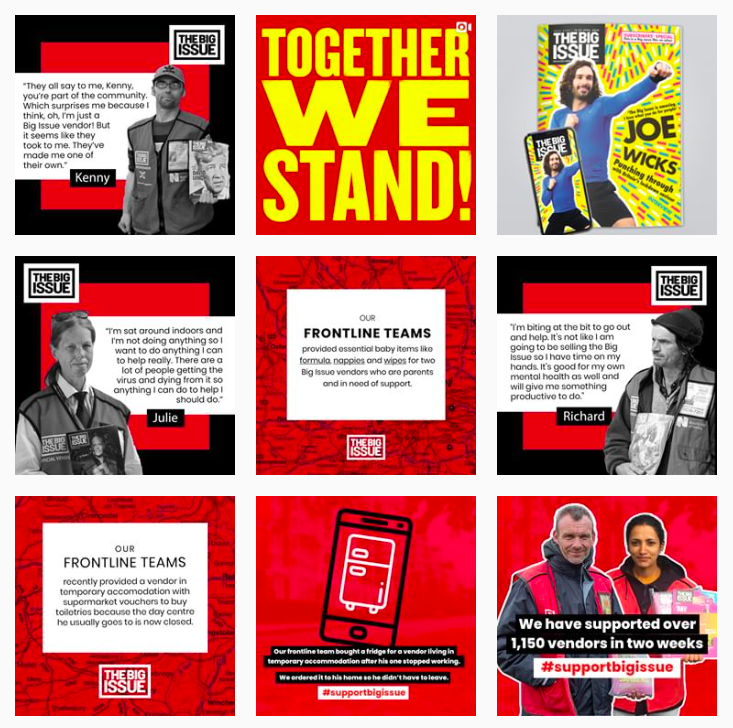
For example, on their Instagram account, the Big Issue uses graphics in their brand colours of red, white, and black but they use a range of templates and designs so that their posts don’t all look the same. They also add in other images when they need to.
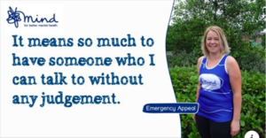
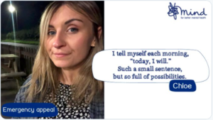
Mind use similar graphics across their social media accounts so they are easily recognisable without being identical. This is an example from their Facebook page.
And this is from their Twitter account.
Ordnance Survey has a clear channel strategy and different content on each of their social media accounts. On Facebook some of their posts use a similar template making them easily identifiable when they appear in feeds.
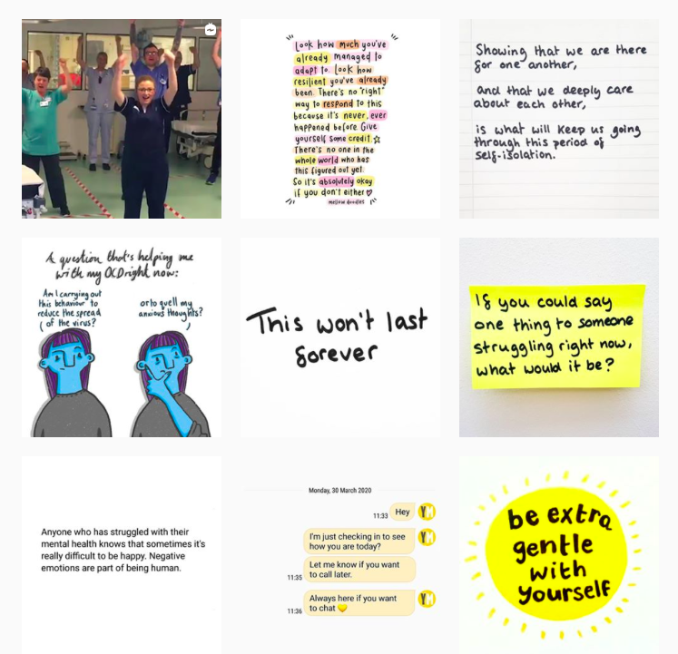
Young Minds sometimes use hand-written graphics and post it notes as a theme for their Instagram posts, but again not exclusively. They also often include yellow. It’s good to maintain variety but maintain a thread of consistency.
Good quality social media graphics can help you communicate more effectively, reduce the need for photographs to accompany all of your posts, and give a consistent feel to your social media activity. If you have any questions about any of these tools or ideas please get in touch. We’re happy to help.