
A couple of years ago, we did some thinking as a team about our proposition.
If you’ve known Helpful a few years, you might remember us for things like consultation websites, disruptive WordPress intranets or blogs. We’re still proud of that work, but we do a wider, different range of things these days. So we changed our strap line from one about our good value, to focussing on the challenge we actually work on day in, day out, building teams’ confidence communicating in a digital world.
We’ve taken a bigger step forward with that recently with an update to our visual identity, and a full rebuild of this site.
My colleague Anthony has written about the evolution of our visual brand, and the thinking we’ve put into readability, accessibility and use of our new identity. Like any good architect, he cringes at the loft extensions and conservatories we (I) bolted onto the 2015 site he crafted. But the reality is that organisations evolve and change, and things need tidying up – or radically rethinking – once in a while.
For instance, we found we struggled to convey the global range, scale and diversity of the work we do to prospective clients, and even boiling it down into a bald list of ‘services’ is quite hard. Whilst we never want to overcomplicate things, some people only know us for one product or sector when the real menu is much broader. The ‘stories’ approach we’re taking with our homepage and pared-back content elsewhere is designed to help new clients get a sense of that at a glance, whether they’re from an airport security team in Canada, a fashion PR agency in Hong Kong or a government department on Whitehall. Even if a client still goes on to order the burger, they hopefully get a sense there’s a world buffet to choose from too.
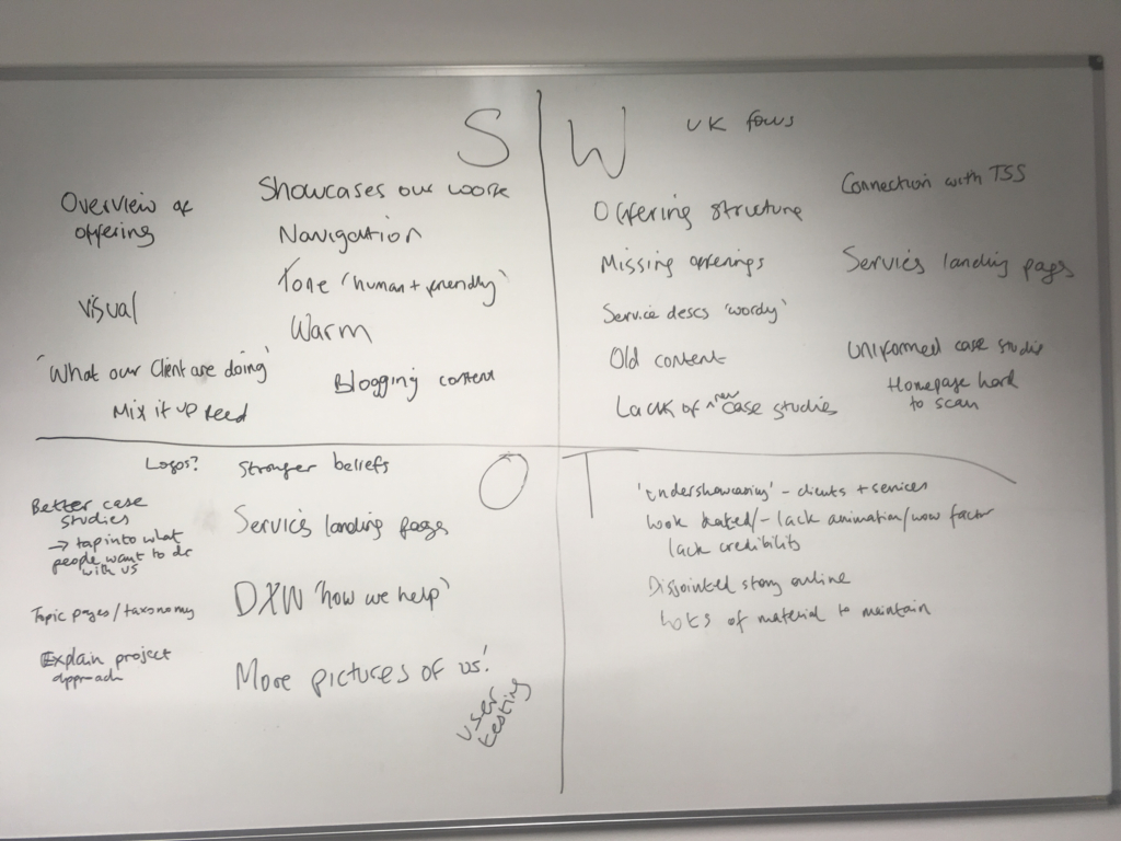
The new website project helped us trial some new methods. We reviewed analytics, workshopped strengths and weaknesses, looked at what we could learn from competitors, and shaped a reasonable brief, which you can read here. The design process followed our new approach of building from a pattern library of UI components we know from user research work well for this type of content and audience. Using Fractal helps us improve consistency and modularity, and move from UI to code components and templates in a controlled way. We layered on visual design later in the process once we knew more about content and structure – in fact, for a long time we worked on a greyscale prototype to check content and templates would work together. Unlike earlier iterations, this site was a real team effort, and run much more like a client project than we’ve done before.
And yet. Content – as it is for many of our clients – proved a blocker, as winnowing and revamping case studies, services and background content got held up by me and took longer than we thought. We still don’t quite have the ‘story’ content we hoped for, but we’ll get there. Ultimately, setting a firm date for launch helped to focus our minds, as did being firm with ourselves that a site could go live and be iterated post-launch. After all, it’s a website not a brochure.
Ultimately, the proof will be in the connections it helps us to make and whether people react with surprise or knowing nods when they meet us and hear what we do. So far, so good.