
When the Weather Channel posted their video warning of Hurricane Florence, it soon started popping up in timelines all over the internet.
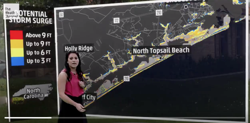
Storm surge will be a huge factor for Hurricane #Florence Check out what it might look like with @TWCErikaNavarro: pic.twitter.com/TPqTZTmiAM
— The Weather Channel (@weatherchannel) September 13, 2018
What started as a run-of-the-mill weather report…
Soon turned into something altogether more attention-grabbing:
WIRED has a great write-up of how the visualisation was put together:
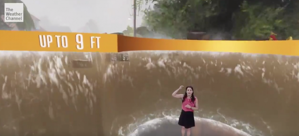
On one level, yes, the visualization literally just shows what three, six, and nine feet of water looks like. But it’s showing that in a context most people have never experienced. It fills in the gaps of your imagination, and hopefully underscores for anyone in a flood zone all the reasons they should not be.
A year ago, this wouldn’t have been possible. In fact, this specific demonstration wouldn’t have been possible a month ago. The Weather Channel only finished the new “green screen immersive studio” at its Atlanta headquarters this week. With peak hurricane season coming, it wanted to be prepared.
Sure, this is about competing for television and social media viewers with shock and awe. But it’s also a great lesson in the power of images for warning and informing, and steps things up a notch for those in the emergency management field.
The evidence is clear from public health that graphical warnings are more impactful and ultimately effective than text alone, however bold and strongly-worded. We take in more detail visually, and video is the most powerful visual medium we have.
But as the technology is maturing and becoming more affordable, it’s opening up new opportunities for green-screen video and digital simulations of the impacts of serious incidents. Extreme weather is the start – even overlaying footage of previous extreme events or the human cost of earthquakes or hurricanes could prompt audiences to pay attention and internalize the message more effectively. How about showing slow moving traffic lines to re-inforce the message about evacuating at-risk areas ahead of the rush? Or even augmenting the real-world interior of an aircraft during safety demonstrations, adding the real air crew into simulations of doors being opened and emergency lighting being activated, to help passengers visualize their escape routes and obstacles?
‘Peacetime’ – as The Weather Channel found – is the time to do your prep work, when it comes to crisis communication. If immersive green-screen studios are beyond your budget, start small. How could you increase the visual impact of some of your stock ‘evacuate now’, ‘be prepared’ messaging – experts talking through the implications over stills or video of past events, or first-person footage of the actions you want people to take?
Let’s turn words in to diagrams, diagrams into news graphics, and graphics into videos, and achieve some of the ‘wow!’ reaction TWC’s Erika Navarro evoked when she stormed onto our screens last week.
