Last year, we had our first Helpful Firebreak, where the build team took 2 weeks from the usual project work to focus on internal projects.
You can read about the highlights of our first Firebreak.
This year we did things slightly differently, based on our learning from 2018.
What was different?
1 week instead of 2
We found last year that over 2 weeks there were too many distractions and project work whereas a week would be easier to focus. We held the firebreak during a quiet week so we could solely focus on firebreak tasks. For projects that overlapped with the firebreak, we ensured we gave plenty of warning to clients that we wouldn’t be available.
Refining the list of projects
We had a planning meeting the week before where we came prepared with what we wanted to work on. We all shared our ideas and discussed where there was overlap and the potential to team up. This meant there were fewer projects but more of a chance of getting tangible results.
What we did
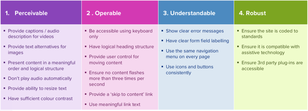
Accessibility guidance – Katie

There are new accessibility requirements arriving in September for public sector bodies. The feedback from clients is that there was no plain-English information online about what they needed to do. We used the firebreak to learn in detail what the new requirements entailed and wrote a guide which we emailed out to clients.

You can download our accessibility guidance here.
Twig – Anthony
 Something I’ve been keen to implement at Helpful for some years is separation of concerns within WordPress themes, specifically separation of presentational code (HTML) from logic (PHP) in the same way that styling (CSS) and DOM manipulation (JS) are forever separated.
As the Helpful build team expanded over the last year, the need for separation became more pronounced – one developer might need to wait for another to finish, two code bases might need stitching together, indeed code resembling a fresh spagbol might need detangling in order to make a tiny design tweak.
For Firebreak I built a WordPress theme using Timber. Timber is a WordPress plugin that allows for the use of Twig, a PHP templating language, within the theme folder (h/t to Mat Passmore for reigniting interests). A bunch of tricky templates didn’t take long to prepare with the help of Serena Piccioni, and my overall impression was that we’d ended up with a much cleaner more maintainable codebase – meat and potato if you will, rather than a linguine (sorry, Serena).
I’m happy to say as of November 2019 we’ve already implemented on three projects.
Intranet audit – Howard

I worked with Katie to help make the Helpful Intranet more useful for colleagues. Our intranet contains staff policies, plus answers to questions that folks shouldn’t have to bother colleagues about (like ‘How do I connect to the WiFi…?’)
Like many websites, our intranet has expanded steadily over the years. As content creators, we’re often keen to add new pages. But it’s easy to forget to update them – for example when an internal process changes, or a third-party tool gets a snazzy redesign.It’s also easy to forget to check how a new page might overlap with content already on the site. So, for firebreak 2019, we decided to review and update our intranet content based on needs.
We chose what we thought were the top 30 user and business needs. We created new pages or amended existing ones to meet those needs. This cut the number of pages by about 75%. We assigned each page to one or more of 4 categories (down from 9 before). These were: ’How do I?’, ‘Marketing’, ‘Office and company info’, ‘Staff policies’.
There are bound to be needs we’re not meeting, so we’ll keep on iterating and improving based on feedback. The intranet will never be ‘finished’. Just like any website.
Accessibility audit tool – Calum
 The idea for creating an accessibility audit came about following examination of different ways to record and present accessibility checks on websites. The accessibility checking tools available and their output was somewhat too overwhelming and not really user friendly.
For Firebreak we therefore decided to make a web-based prototype audit, presenting a more digestible presentation with specific details of different checks, issues and possible way to fix them. Besides learning about what to include in an accessibility audit, it also provided the opportunity to expand on features for our components library, figure out some new approaches to single page navigation and customisable user options for print layout.
Proposals – Steph

It can be tricky in a small team tracking down up to date examples and descriptions of our methods that wecan use in reply to a client brief. It’s complicated by the range of formats we need to provide these in: 100 word answers, full page descriptions with examples, with or without diagrams. Plus, with copy/paste reuse there’s always the risk of embarrassing mistakes under time pressure. Previously, we hunted for this material in Google docs and old proposals on Dropbox, and racked our own project memory, but it felt inefficient and fraught with risks.
For Firebreak, I thought I’d try creating an internal library of proposal material using WordPress’ new Gutenberg editor, but realised that Gutenberg’s unstructured block model wasn’t right here: we need more structure to organise those snippets of text. What I came up with was a basic theme using Advanced Custom Fields to structure short/long form snippets with examples and image galleries, backed up with ACF’s handy front-end editing functions to enable easy updates when snippets are expanded or improved.
Trello – Matty
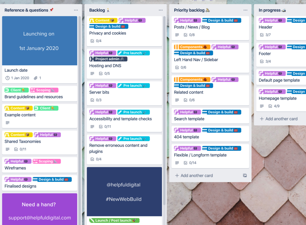
 We use Trello for all sorts of things within the office but probably the most important is, during a web build, as a shared workspace between us and our clients. We felt this was a good time to have a fresh look with a goal of making the ‘journey’ as transparent as possible for the client, providing explanation of what’s happening along the way in plain English, while also allowing the team to communicate at a fairly granular level.
The use of labels allows all to see who is responsible, at a team level (individuals generally join and leave cards as necessary), and where the card slots in terms of stage. We loosely follow the agile methodology of breaking projects up into more accessible chunks and organising based on when they are happening. In addition to this we also included a ‘Reference & Questions’ column for easy access to branding material for example and also for clients to pose queries not directly related to a card already in the timeline.

Would we do anything differently next year?
This years firebreak worked well and so I think we’d try it again in the same format next year. We got a lot done in the week and some of the projects have transformed the way we work.
As Helpful continues to grow, we may split the firebreak over two weeks with different teams, so we are able to continue with projects and are less distracted by inevitable support tickets.
