The Helpful website recently underwent a facelift and I managed to sneak our brand into surgery along with it. It’d been a little while since we’d made any significant changes to either, five years to be exact, and on that pretext I managed to get my own way a little more than I might. Here’s a little breakdown of some of the thinking behind it all.
Where’s the space invader?
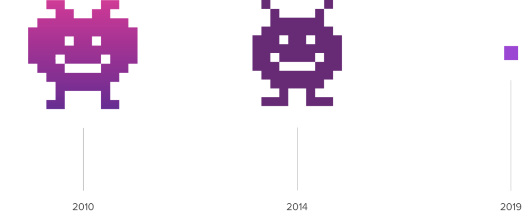
I’m not exactly sure of his backstory, but the Helpful space invader has loomed impishly in the corner on websites, in presentations, and print since as long as I remember — too long, I’d heard grumbled on occasion.
In 2014 I succeeded in dieting Mr Invader down slightly, making him less pumpkin-like, and more symmetrical. And in 2019 I’ve managed to diet him down further still. He’s still here, he’s just, well, smaller, and features more subtly nowadays — something that suits the business better as it approaches double digits, I feel.

The 2019 logotype is a bit more mature, and without an icon has a more solid footprint. Mr Invader lives on in low res form as an offset. But don’t be sad. He also sneaks his ear into the corner of coloured backgrounds, and most of all you can feel his pervasive spirit influencing thumbnail dimensions and the overall pixelated feel about the place.
Futura and Proxima Nova
For Helpful’s typography Futura Bold and Proxima Nova replace Monserrat Regular and Open Sans — never a happy marriage, I felt.

Futura is an iconic 1927 typeface by Paul Renner that communicates efficiency and forwardness. Its geometric forms and near even weight strokes work well with our pixel theme, and its solid mass helps with visual hierarchy — something previously lacking.
Proxima Nova meanwhile is our workhorse. Its geometric forms and proportions also give our voice efficiency, and because of its numerous weights and generous x-height, it has plenty of versatility and clarity on screens, even at the smallest of sizes.
Amethyst, Helpful’s new brand colour
For our new brand colour we’ve moved around the colour wheel slightly from Seance, which felt somewhat heavy and somber, to Amethyst (or Dark Orchid, depending on who you ask).
Amethyst is a variety of quartz, and among the Ancient Greeks it was thought to protect its bearers from intoxication. Not a perfect fit then. Nevertheless, what’s important is it’s lively and vibrant and therefore better communicates the company’s disposition going into 2020.
We’re sticking with it across all properties for consistency and recognisability.
Blues and greens also feature in our new palette:
Columbia Blue replaces lime as our primary accent and Curious Blue replaces violet for headlines and colour blocks – Columbia is cool and calming, Curious is technical and authoritative.
Sea Green and Caribbean Green are used more sparingly and inject a bit of aquatic calm and harmony into the palette – important qualities in crises and digital capabilities.
We also have a bunch of additional accents which can be used to help categorise, highlight, differentiate, and generally liven things up a bit, particularly on PowerPoint presentations when we have a bit more freedom to stretch out:
Vectors, isometrics
Lastly, our pixel theme informs our imagery: we favour 1×1 image dimensions, full bleed, geometric forms, and clean minimal vectors, particularly isometrics.


Photography
Photography is used carefully, and when it is, we avoid poor quality mobile phone snaps, cheesy stock photography, and prefer events themselves over the sometimes alarming scenarios they simulate.
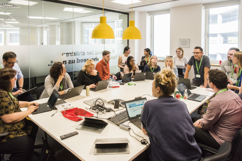
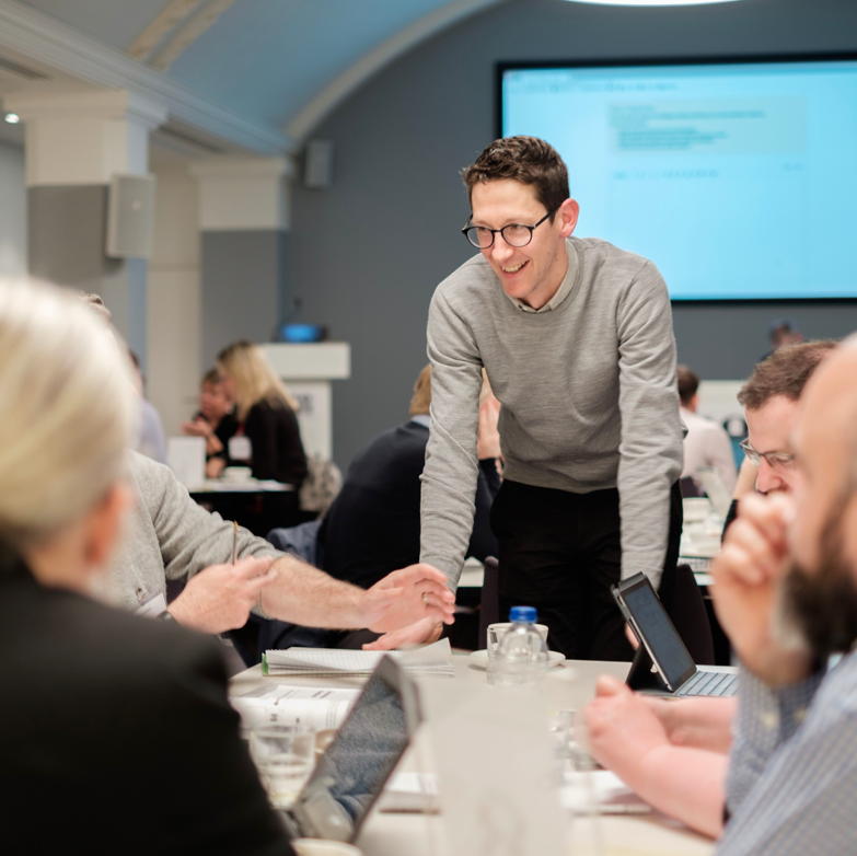
In general, we look for:
- Positivity, empowerment, expertise, friendliness, creativity
- Well lit and well composed subjects with good dynamic range
- Resolved photographs, i.e., a single point of focus
- Depth, e.g., a room vs a wall
- Simple rather than busy
- Related, e.g., related colours and style
Isn’t that right, team?
Artful photography
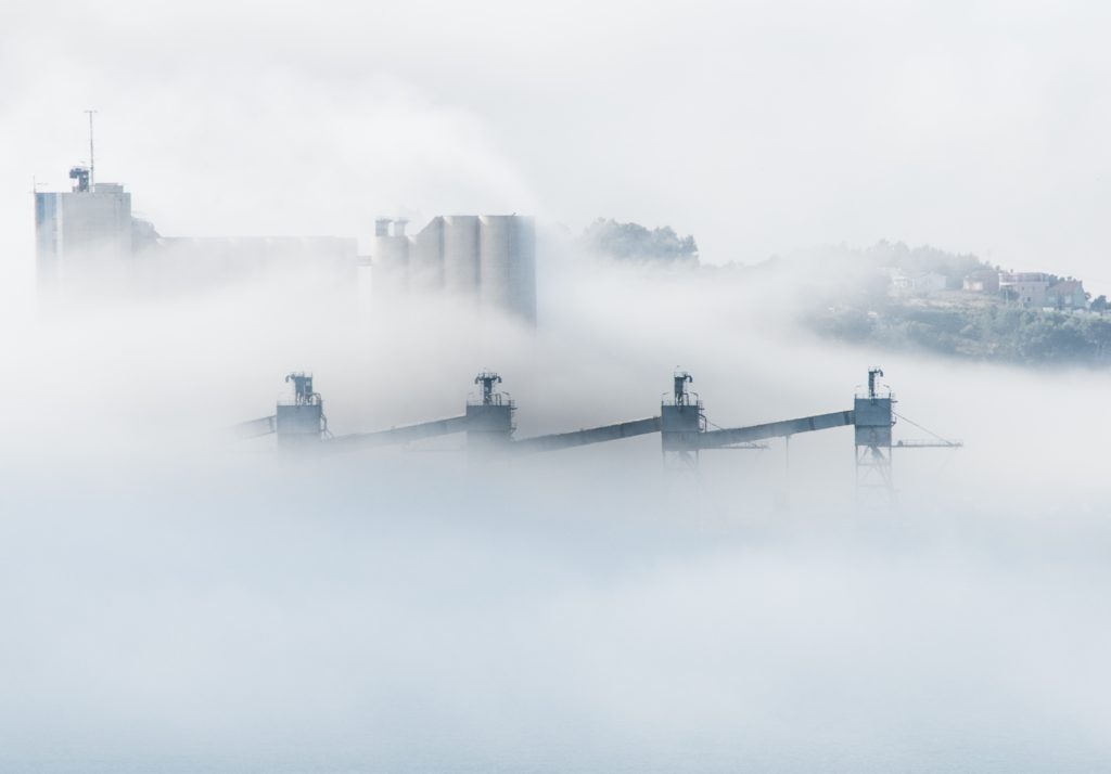
It’s not always possible to photograph simulations and training sessions, in which case it’s better to illustrate in some way the subject of the simulation or the nature of the client’s work. On these occasions we’re careful to avoid anything too downbeat.

Screenshots
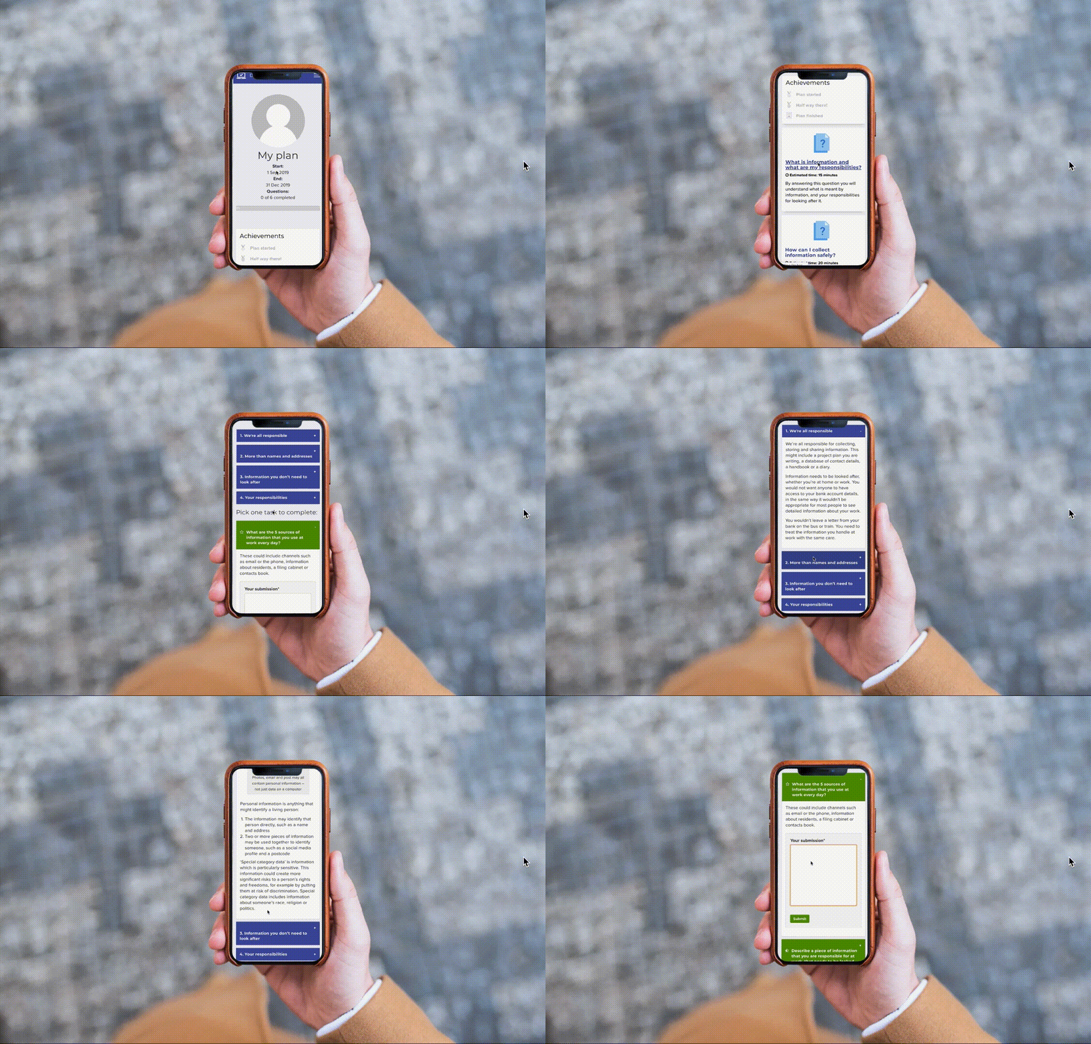
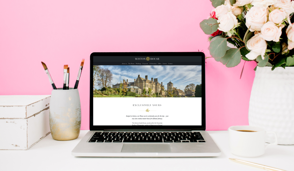
In the case of web build work, screenshots are preferable although we’re careful to present these in context – i.e., a photograph of a screen with the screenshot on display rather than an actual screenshot itself. Video can work particularly well here.
Over to the client
It’s been an interesting and at times fun process adding some paint here, a potted plant there. The 2014 brand refresh wasn’t quite as dramatic, but the old Helpful Site was given a fair bit of thought and began life in a fairly aesthetic state, I felt. Alas, it wasn’t long before dodgy shelving units went up and grandma’s tea chest was wheeled in — always the danger when clients have code access. We shall see how long this one lasts! Watch this space.
