Accessibility on social media was one of the topics I covered in my ‘Crisis Communications on a Shoestring Budget’ talk yesterday at the Public Sector Crisis Communications Conference in London. Excitingly, the concept of improving accessibility for graphics and images on social media was well received. In crisis or not, allowing for social media content to be accessible for everyone, including those who use a screen reader, is crucial to communicating effectively and inclusively.
Whilst many agencies across the public sector have made advances in accessibility online, I believe there is still a gap when it comes to social media. Adding ‘alt-text’ to images and graphics allows for those with a screen reader to understand what other people can see. Although the adding of alt-text to images still isn’t common practice, when it should be the norm. After reviewing a few government channels today, I was pleased to discover that there are now more agencies making their graphic social media posts accessible. My initial look around Twitter found that consistently using alt-text are DWP Digital and Public Health England, along with UK Parliament and the Department of Health and Social Care. After attending my talk, the Legal Aid Agency started making their graphics accessible the very next day – a fast and valuable move.
Why aren’t accessible images and graphics common practice for every government channel on social media? I feel the answer has two parts: a lack of awareness, and a lack of capability. The lack of capability I believe, in part, rests with the restrictions imposed by social media publishing tools. Depending on the tool an agency uses to post on social media, there are limitations for adding alt-text. Looking into this a little deeper, it appears Hootsuite has some capability, Zoho Social does not, and Buffer allows for alt-text to be added to Twitter but not LinkedIn. In short: it’s not a process teams can do easily and consistently.
If agencies can’t login and access their social media channels natively due to security restrictions, it’s even more important to explain everything in the text field of a post. Whilst this is best practice anyway, in the absence of alt-text, everything about the graphic needs to be in the body of a post so it is recognisable by a screen reader. This recent post by Department of Health and Social Care has alt-text, but even if it didn’t, every important detail featuring in the infographic is explained in the text:
UPDATE on #coronavirus testing in the UK:
As of 2PM on Friday 31 January 2020, a total of 177 tests have concluded:
175 were confirmed negative.
2 positive.Updates will be published at 2PM daily until further notice.
For latest information visit:
▶️ https://t.co/CZh5JdyN2Q pic.twitter.com/j0tsLpdXrb— Department of Health and Social Care (@DHSCgovuk) January 31, 2020
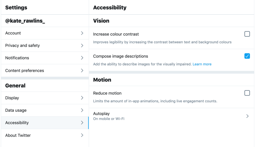
In terms of awareness, it’s knowing how to add alt-text to posts – and this varies per social network. On Twitter, accessibility has to be switched on in profile settings:

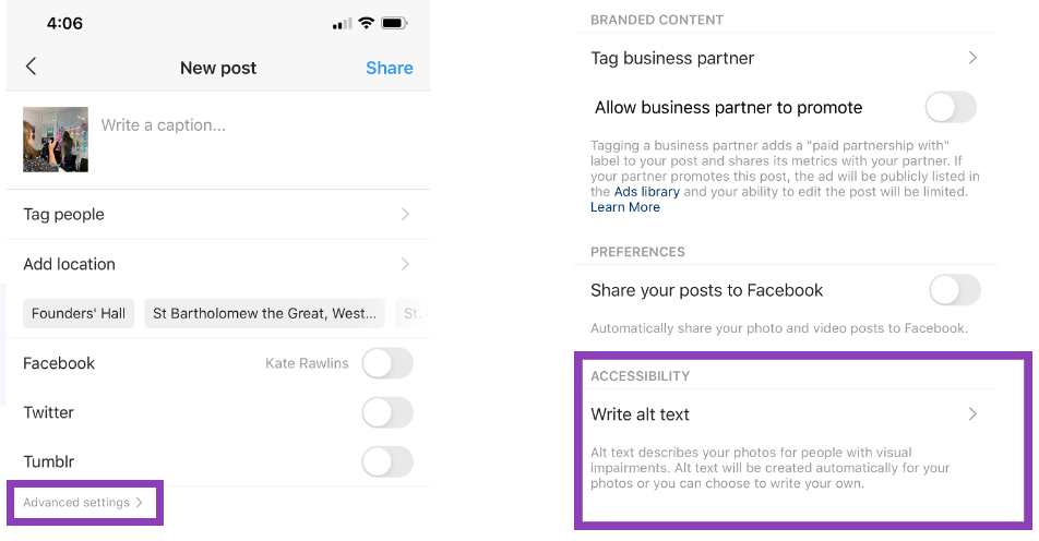
On Instagram, alt-text is added at the final stage of a post, in advanced settings:

Adding alt-text is the first step, the next is getting the messaging right. This isn’t just a caption – it’s a description of the whole content piece. The level of detail put into the alt-text field will explain the context to someone using a screen reader. They are relying on us to allow them to hear the whole story. A recent example of this done well is by DWP Digital:
Here’s one of our #DigitalVoices @ThompsonLesley1 sharing her experience as a #BusinessAnalyst at #PPNorth today
“User centred design is at the heart of everything we do … the work we’re doing is really impactful”#ProductPeople pic.twitter.com/fsd0WN4E0e
— DWP Digital (@DWPDigital) January 31, 2020
The alt-text is: “Lesley talking at the front of the room”
The alt-text is descriptive and provides as much context to the post as viewing the image.
The Royal National Institute of Blind People have a useful guide available for correctly writing alt-text descriptions on Twitter.
Remember: it shouldn’t be up to us to decide which images are or are not worthy of adding alt-text. If it’s a stock image, a visually impaired person is still entitled to know what it is – and make the decision about relevance for themselves. If it’s a routine picture of the front of the department’s building, it’s still important to say so. No one should be left wondering what something was, or felling as though they have missed out.
It was encouraging to see how many people at the conference saw how important it is to improve accessibility on social media. In the wake of a current health crisis, it highlights now is the time to start making accurate information available to everyone. When I speak about disinformation/fake news, I argue that if you don’t provide people with the right information and allow for a gap, someone else will fill it. This applies to accessibility too – why should people with a vision impairment not be able access information directly from a government agency on social media? The risk of having to look for it elsewhere and the information potentially not be right is a whole other problem, let alone not okay.
Today is the day to start communicating inclusively on social media.
Interested in more about accessibility on social media? Read our advice on using emojis, hashtags and multimedia in an accessible way online.
